Buttons!
Adding a button to a screen is one of the first things new B1UP users learn to do. Just launch the screen, right-click, then select 'Add Function Buttons to this Window' - this is one of the simplest ways to customize a screen. And you can do great things with these buttons - launch other screens, run B1UP SQL Reports and other Universal Functions, control when buttons are active, define space-saving Multi Buttons, and a lot more. There are some great videos on using Function Buttons. So life is good! Well until questions start coming up...
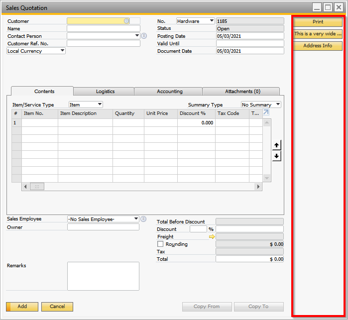
- Does it have to take that valuable screen space on the right?
- Can the buttons be active only when a certain tab is active (some buttons are only used on a certain tab, others should be active for all tabs)?
- Is there a way to separately define the width of each button?
- Why don't screens with the function buttons always 'remember' the screen size when they are resized?
These questions and more are addressed by changing the way that the buttons are deployed. How? Create buttons using the Item Placement Tool (IPT) and then use Validation Configurations to drive their function. IPT-based buttons:
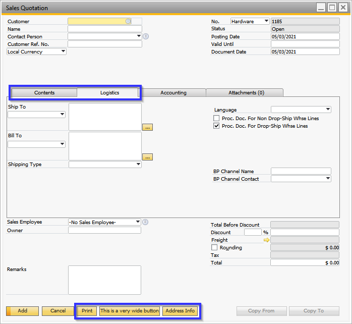
- Don't allocate additional screen space on the right.
- Can be defined to be active only when a specific tab is active or all the time.
- Can have settings such as button width, height, etc. controlled individually, for each button.
- Can be placed anywhere on the screen using the IPT's Relative Placement or Pixel Placement.
- Don't have the screen resize issue because they don't change the size of the underlying screen.
Isn't there a way to move the buttons using the IPT? Is this the same thing?
Yes, buttons created with Function Button definitions can be moved and further controlled using the IPT. There's a great video on this here: Item Placement Tool - How to move Function Buttons to another location – Boyum Helpcenter (boyum-it.com).
This improves things for several of the limitations, but it doesn't cover all of the issues.
Ok, how do we migrate buttons from Function Buttons to the IPT?
Here are the steps:
- Item Placement Tool
- Launch the Item Placement Tool screen.
- IMPORTANT: If you aren't familiar with the IPT then please first review the extensive online content on this topic. This includes help / documentation, videos, and Community Help Center postings. What follows assumes familiarity with this topic.
- IPT-based buttons are created in the 'UDF and Customer Item Lines' grid (the lower grid). Click the Add button on the right side of that grid once for each button to be created.
- Details for each column in this grid:
- Active: On by default. Clear if you want to keep the definition data but not see the entry.
- Item UID: Accept the default Item UID column value or create a unique value if desired.
- Description: Enter the button text in the Description column. This is the text the user sees on the button.
- Table and Field: Clear the Table and Field columns.
- Placement Type: Select an option from the Placement Type column's dropdown list. Relative Placement is recommended over Pixel Placement, so it is usually best to choose one of the 'Place above / below / left to / right to' options.
- Item Relation: Required when using Relative Placement. To place the new button next to an existing button (say to the right of SAP's 'Cancel' button) get the Item ID of the 'anchor' button and enter that value in the Item Relation column. Other screen objects can be used as the 'anchor object', for example putting a button below an existing screen field.
- Item Spacing: Optional, applies when using Relative Placement. Use this to adjust the appearance as desired.
- Type: Set to Button.
- More stuff: Set the Width and Height as desired or leave them blank for the default size.
- Yet more stuff: Set the From Pane and To Pane to match the desired screen tab for the button. Set both to -1 for buttons that are available on all tabs.
- And still more stuff: Check or clear the 'Edit: Add', 'Edit OK', and 'Edit: Find' settings so that the button is active only when it should be active.
- Click Update to save the IPT definition.
Here are the results: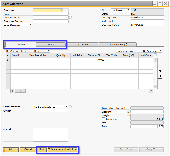
And here's the IPT that made it happen: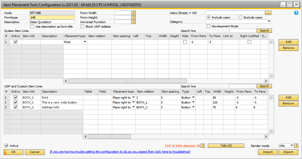
- Launch the Item Placement Tool screen.
- Validation
- Launch the Validation Configuration screen.
- IMPORTANT: Same comment as above - if you aren't familiar with the Validation Configurations then please first review the extensive online content on this topic. This includes help / documentation, videos, and Community Help Center postings. What follows assumes familiarity with this topic.
- Create separate Validations for each button that was added to the screen.
- Details:
- Name: Enter a meaningful name for this validation.
- Formtype: Enter the Formtype of the screen where the button was created.
- Item: Enter the button's 'Item UID' as defined in the IPT.
- Event: Select the value 'Item Pressed'.
- Condition: It is usually best to use the 'No condition' option and select the desired Universal Function. This is the UF that runs when the button is pressed.
- If you want to use a SQL Condition in the Validation then instead consider deploying that condition with the UF. That way all logic is in one place. If the same UF is being used from several Validations, then these Special Keywords $[CURRENT_FORMTYPE], $[CURRENT_FORMTITLE], $[CURRENT_PANE] in the UF's logic to determine what screen it was called from.
- The UF can use the ACTIVATE() command to open all the screens, including those that are options in the Function dropdown on the Function Button definition.
- If the button being redeployed uses the 'Do Nothing' option then either don't create a Validation for the button or clear the Active checkbox on the button's Validation.
- Launch the Validation Configuration screen.
That's all good but how do I redeploy my Multi-Buttons?
Follow the steps above with the following changes:
- Item Placement Tool
- Description: This is the text of the multi-button before it is pressed
- Type: Set this to ComboButton (instead of Button)
- Valid Values: For each ComboButton enter the value to be returned by the ComboButton option followed by the text description of the ComboButton option. Put a comma between the value and the description, and put a semicolon between entries for each menu option.
- For Example, 1,BP;2,Item results in two menu options the first returns a value of 1 and description of BP, the second option returns a value of 2 with the description of Item.
- The B1UP help links to this video on the IPT's Valid Values: (3) Item Placement Tool - UDF Lines and Valid Values - YouTube.
Here's the ComboButton using the example above: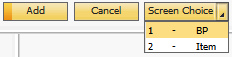
- More stuff: Valid Values can also be variable, or data-based. To do this create a query that outputs 2 columns - the first is the value and the second is a description of the row. Each row in the query output corresponds to a menu option. This example creates a menu option for each year where Sales Invoices have been created:
SQL:SELECT DISTINCT YEAR("DocDate") , CONCAT ('Sales Year ', CAST( YEAR ("DocDate") AS VARCHAR) ) FROM OINV ORDER BY YEAR("DocDate")
The linked Universal Function will use dynamic syntax to test for selected menu value (first column).
Here's the ComboButton using the query example above: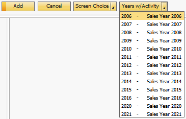
- Validation
- Event: Change to 'Combobox Select'
- Before Action: Ignore
- Action Success: True
- Universal Function
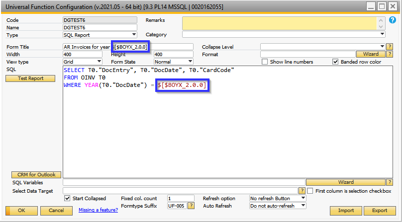
- Add logic to the UF that tests the value of the ComboButton's value using dynamic syntax.
- This logic works with the first example, the 'Screen Choice' ComboButton:
IF $[$BOYX_1.0.0] = '1' // ComboButton's value from IPT Valid Values column
BEGIN
ACTIVATE(2561); // Open BP Master
END
ELSEIF $[$BOYX_1.0.0] = '2' // ComboButton's value from IPT Valid Values column
BEGIN
ACTIVATE(3073); // Open the Item Master
END - And this SQL Report works with the second example using the query to build the options:
- This logic works with the first example, the 'Screen Choice' ComboButton:
- Add logic to the UF that tests the value of the ComboButton's value using dynamic syntax.
In summary, B1UP has three ways to define buttons:
- Function Buttons are the easiest to create but have some limitations.
- Function Buttons with an IPT to fine-tune the buttons.
- IPT-based buttons which give the most control but add some complexity.
Comments
0 comments
Please sign in to leave a comment.